Ahead of the 2019 Pride celebrations, sweets brand Skittles decided to replace its iconic packaging with a more LGBTQ-oriented one. With the help of London brand and packaging design agency Straight Forward Design, the company gave up its famous packaging in favor of rather unusual design, “because during Pride only one rainbow matters.”
To achieve its new Pride look, the brand worked closely with some of the community’s members, because it decided that this year, they should be directly involved in the initiative. While keeping the brand’s ambitious wish in mind, the London-based design studio developed a concept of working with artists who identify themselves as LGBTQ+ to create limited-edition designs. The packaging was left almost completely blank to make room for the artists to fully express their imagination. Apart from letting their ideas flow on a piece of paper, the artists were able to also find a place in the Skittles pack where they could communicate their thoughts regarding the Pride itself.

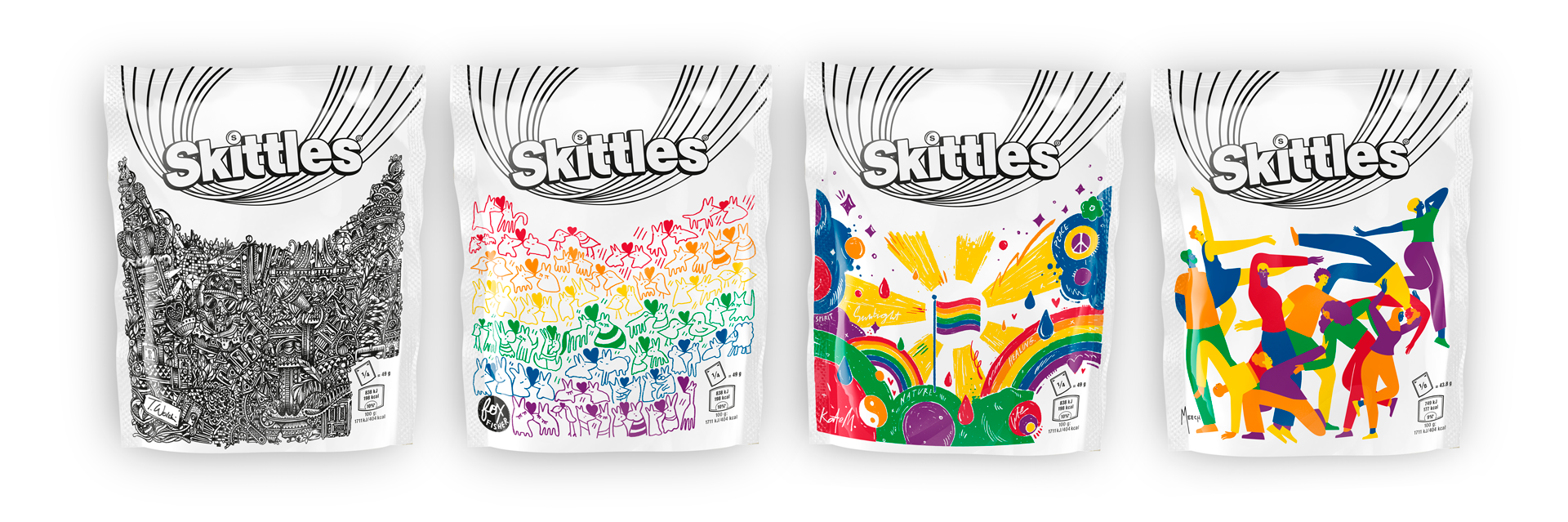
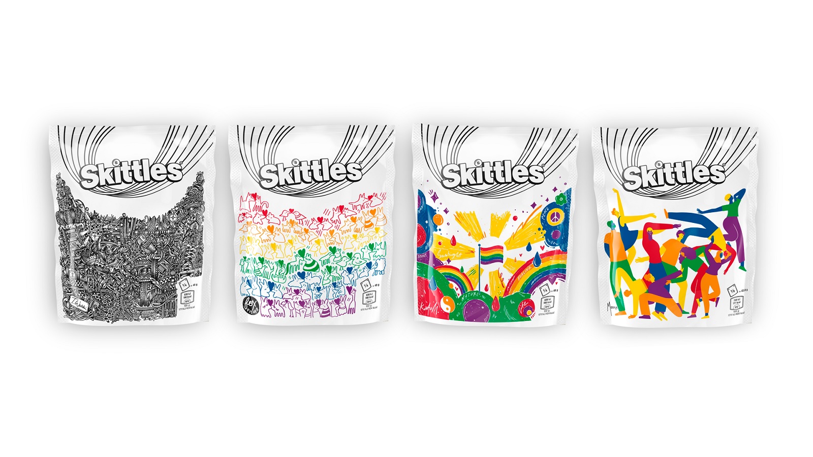
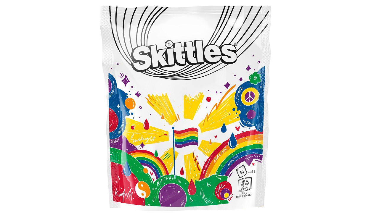
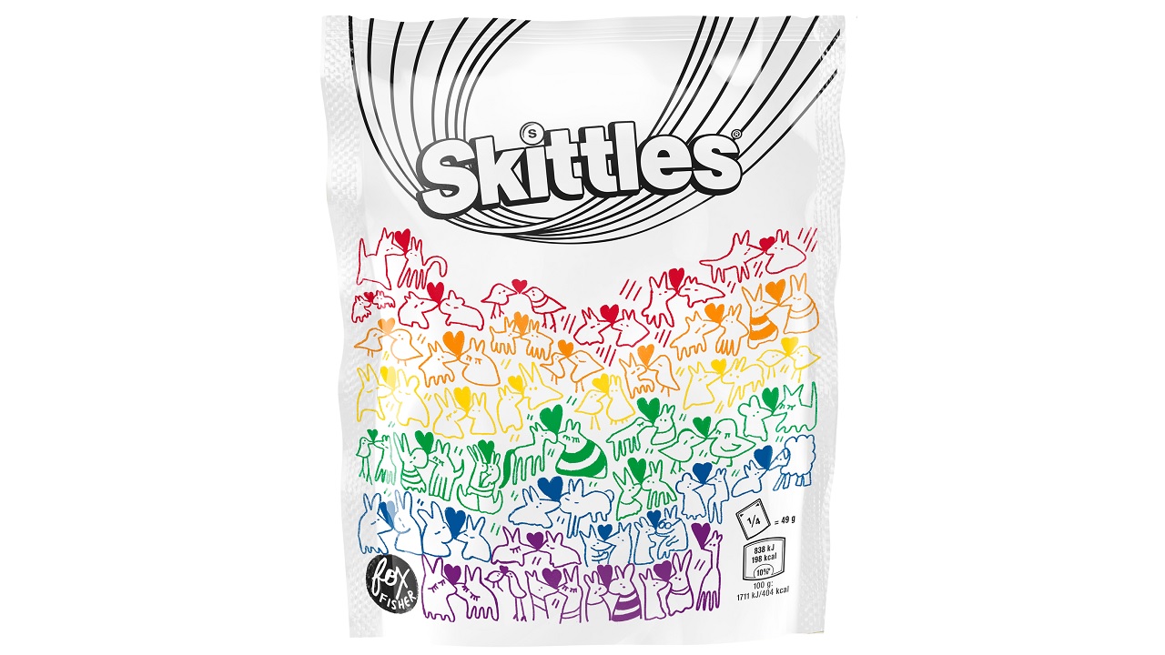
Skittles picked four LGBTQ+ designers to redesign the refreshed looks of their colorful bags. They were presented with the following brief: “What does the Pride flag mean to you?” The artists received the freedom to interpret the question as they pleased (the only restrictions were pack dimensions and the number of colors).
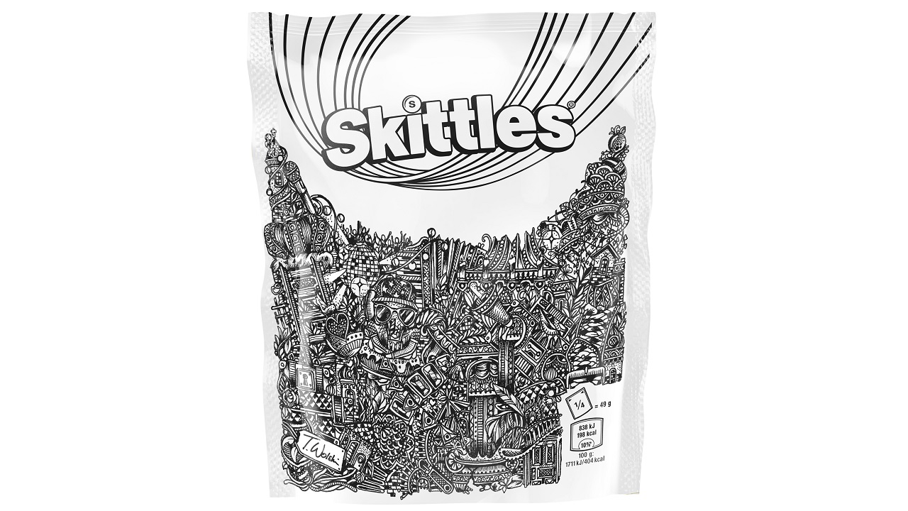
Mike Foster, Co-founder and Creative Director at Straight Forward Designs, zooms in on the creative process: “We were actively looking for ways to create a deeper connection with the LGBTQ+ community when we discovered that artist Thomas Wolski had created a series of works using the ‘rainbowless’ Skittles packs. That got us thinking about working with different artists and creating a collaborative collection.”
Fine artist Thomas Wolski; artist, filmmaker, activist and author Fox Fisher; art director, illustrator and graphic designer Kate Moross, and artist and illustrator Maia Boakye were all asked to become a part of the project because Skittles believes they are the best fit to reflect the brand’s core values and spirit.
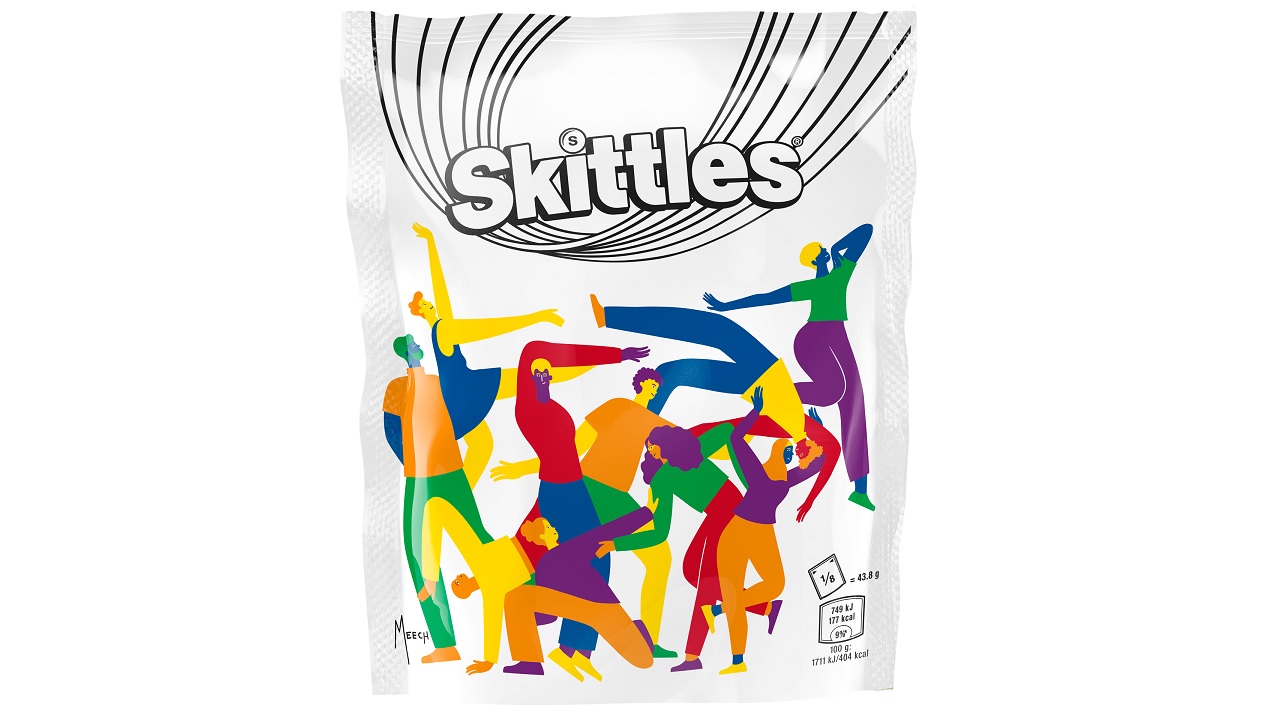
To recreate the chaos and excitement of the Pride celebration, Wolski created a monochromatic pen drawing. The love and respect for everybody is represented by Fisher’s kissing creatures, hand-drawn on an iPad. Kate Moross’s digitally painted work celebrates the origin of the rainbow flag. Lastly, Boakye’s digital illustration speaks about the spirit and the energy of the Pride celebrations.
Mike Foster comes with more insight about the outcome: “There was something very uplifting and exciting about handing over the design of the packs to artists from the LGBTQ+ community. We were stepping into the unknown, but the results have been better than we ever could have hoped.”
This isn’t the first time when Skittles have given up its looks to try on a different, yet still good-looking, coat. The concept of the campaign is based on adam&eveDDB’s “Give the Rainbow” project, in which Skittles give up its vibrant colors to make room for the famous pride rainbow. Back in 2016, the brand dressed its fruity candies in a black and white dress to keep the focus on only one rainbow that matters more. A kind initiative, indeed. Yet, we’d like to take the liberty to say that this time, the brand’s project is more interesting. Do you agree? Let us know in the comments!