Named as one of the 10 most notable British Designers, Michael Johnson defines and designs brands that make a difference. He’s the brain behind Virgin Atlantic’s rebranding and is a RULER by default. What does that mean? He is a strong leader who’s working with people who want to do big things. Johnson wants to positively change the lives of others. You might have come across that last year at Brandingmag‘s REBELS AND RULERS event, where he introduced the “Open Branding in Five and a Half Steps” theme, a concept that is inspired by his best-selling book “Branding: In Five and Half Steps.”
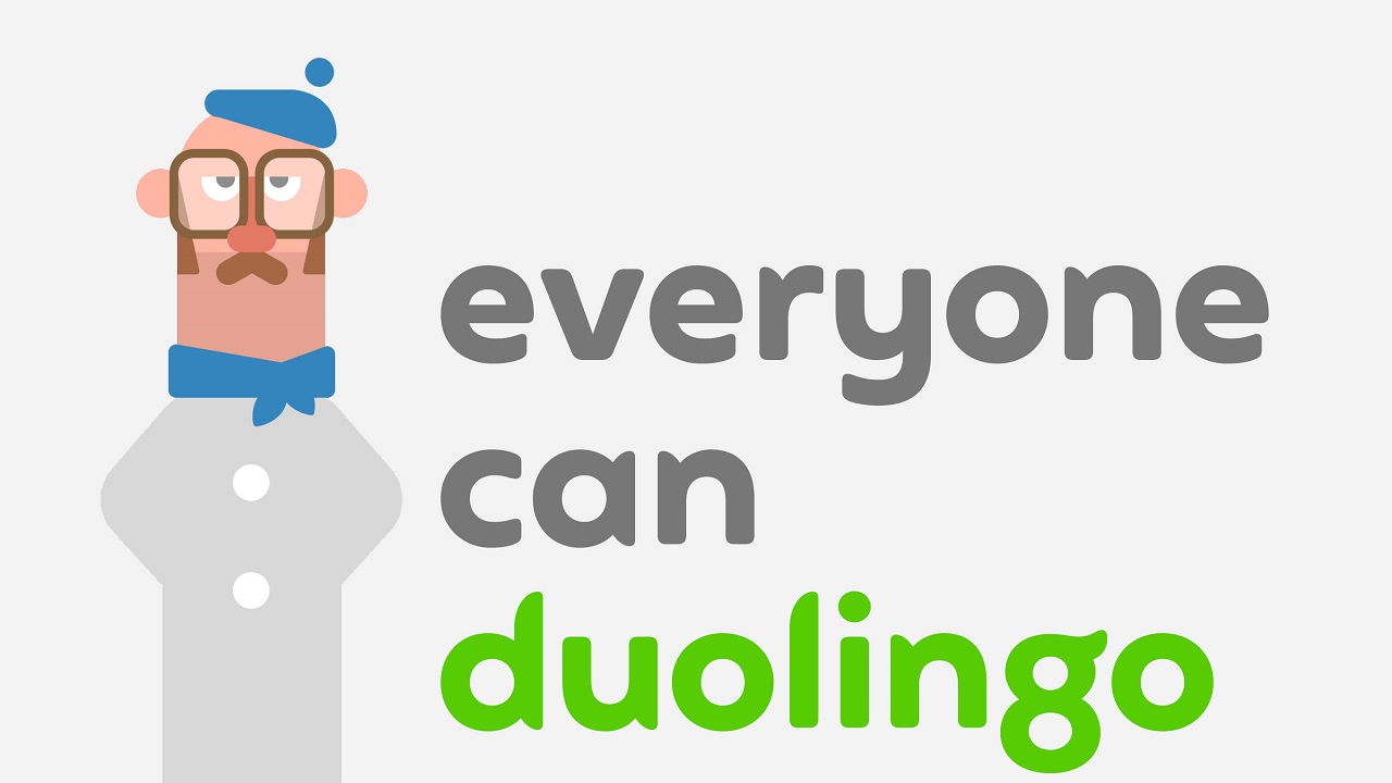
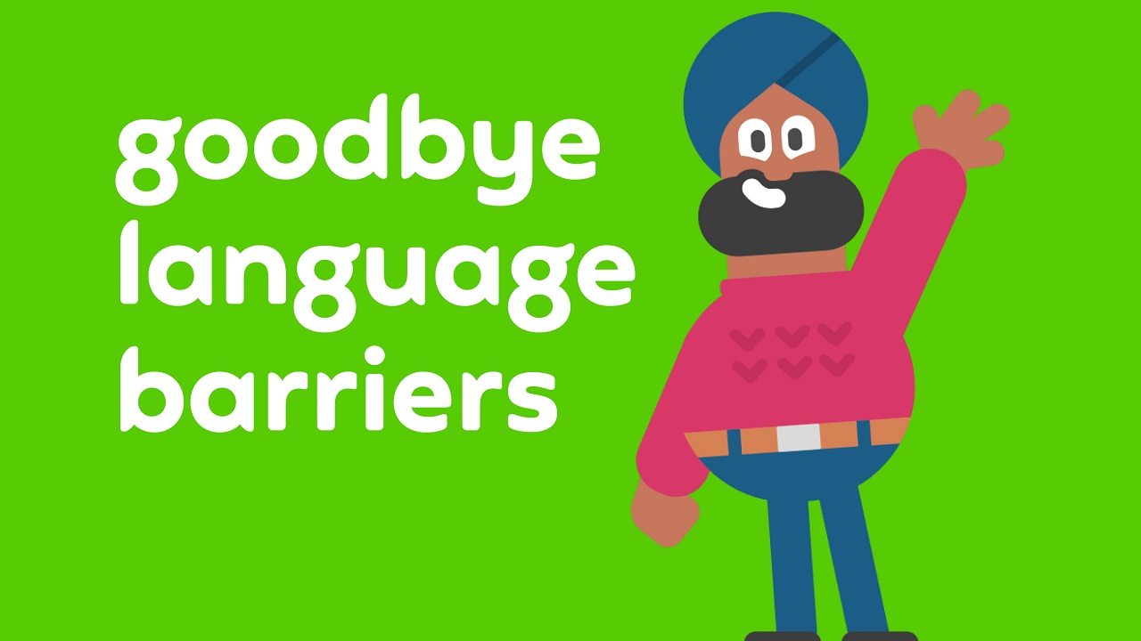
Now, it is time to see what Michael Johnson has got up his sleeves for this year. Just recently, Johnson has closely cooperated with Duolingo—the world’s most popular way of learning a language—to find the best way to reflect the brand’s real core values and likeable spirit. As expected, being a RULER, Johnson didn’t let anyone down. Inspired by Duolingo’s trial messaging around “what Duolingo makes happen, and makes possible,” he started to shape a new visual identity of the company. Using workshops and an internal staff “expo,” he, alongside his team, chose an approach that speaks about the company’s commitment to universal access – namely that “everyone can Duolingo!”
The British designer and consultant drew inspiration from the brand’s mascot, the owl, the colors, and the illustration style. Sadly, the crew didn’t have clear guidelines on how to use Duolingo’s brand away from the app – which, by the way, has been downloaded by an astonishing 300 million people around the world. Other things, such as Duolingo’s ground-breaking online English tests, were pushing the boundaries of the brand structure. So, what to do next?
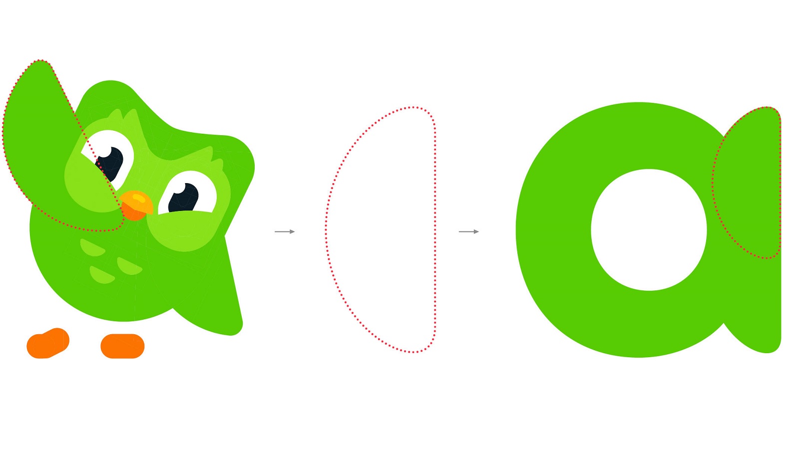
Worry not, as Johnson Banks‘ Founder and Creative Director came up with a solution: A “what if” situation helped unlock the problem. Instead of using neutral typography alongside the symbol (like every other tech company), Johnson and his team redesigned the logotype by drawing inspiration from Duo the Owl’s feathery shape, therefore reflecting the company’s joyous personality.
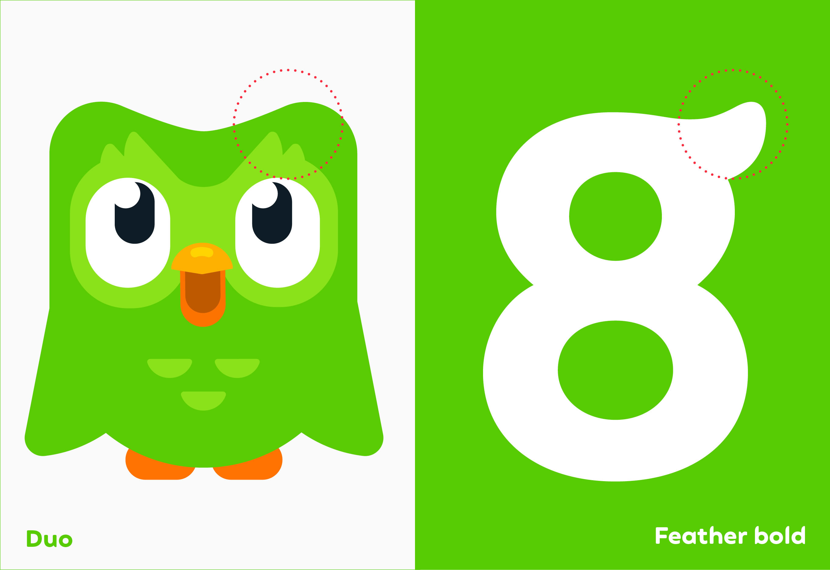
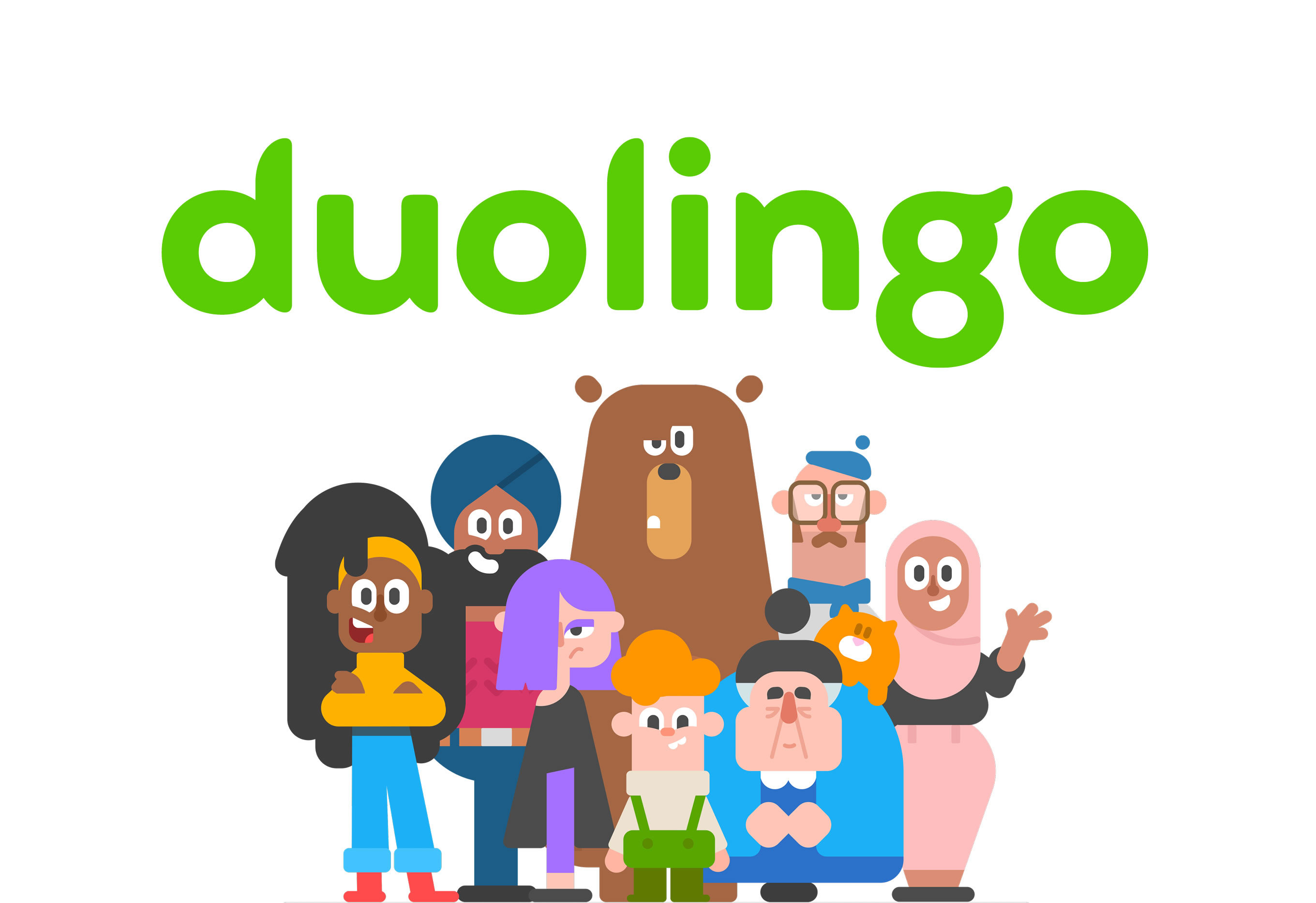
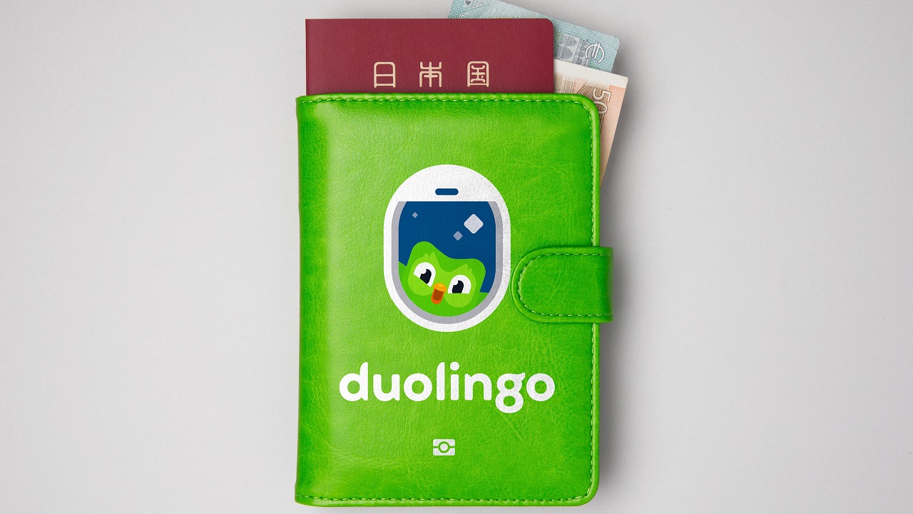
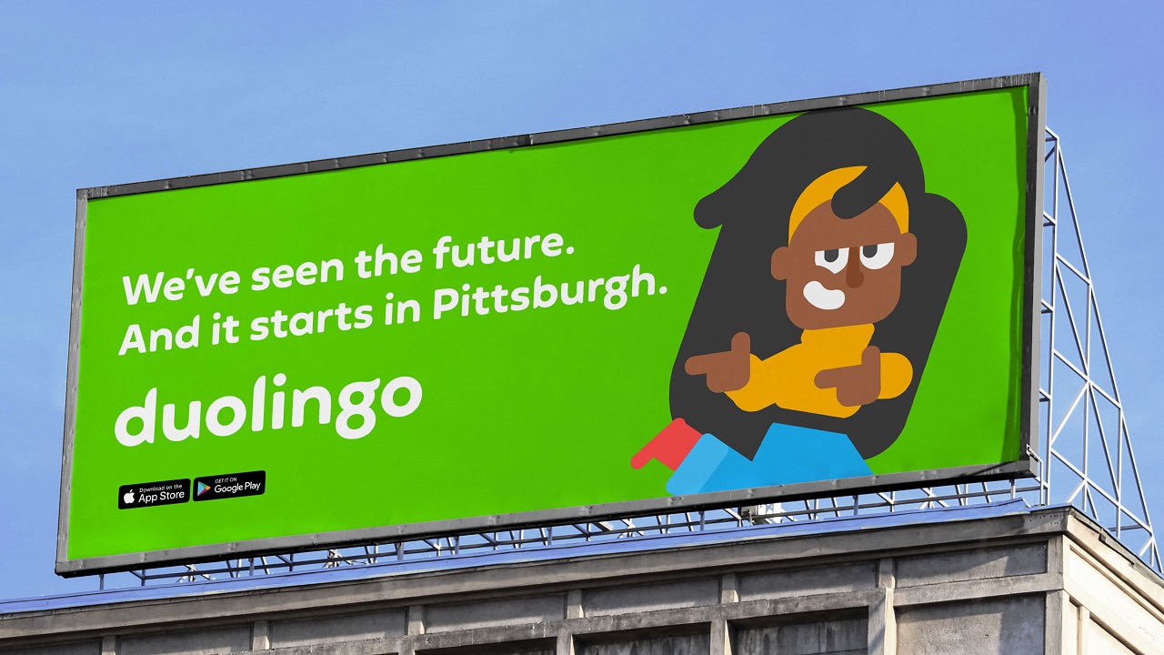
At first, things looked pretty odd. Then, the creative team managed to solve the logo conundrum and started planning a bespoke typeface. With the help of typography specialists Fontsmith, they fine-tuned the logotype and then extrapolated the idea out into more characters. Some letters proved to be troublesome, however, they resolved the issue with ease. Afterwards, they developed a clear tone of voice and messaging while taking into consideration all the elements offered by Duolingo’s visual signature. The logo, colors, typography, illustrations, and other graphic elements got boosted and their new features were captured by photographer Niall McDiarmid. As a result, we can now observe all the new elements in the form of digital and physical applications, including a brand ‘takeover’ at Pittsburgh airport and advertising campaigns in Europe.
“We were amazed to discover how mission-driven every member of their team was. Their desire to help people learn another language, for free, was very empowering to us, coming from a not-for-profit background,” says Johnson about the cooperation. He later adds that “this has been a unique opportunity to develop what is already a much-loved product into a world-beating brand. Working hand-in-hand with the Duolingo team in Pittsburgh, through sprints and workshops, we started with a left-field idea – to draw their logo based on the shapes in their mascot – and an entire design scheme led from there. We’re very happy with where this has turned out – and where it could go next.”
Now that you’ve seen how creative our speakers are, what are you waiting for? Will you be joining us in Bucharest on 17-18 October for our second edition of REBELS AND RULERS? We promise that you’ll meet more great minds like Michael Johnson!
Credits:
Client: Duolingo
Brand strategy, narrative, and design: Johnson Banks
Tone of voice and messaging: Johnson Banks, Nick Asbury, Mary van Ogtrop
Strategy associate: James Wu
Font design: Fontsmith
Brand photography: Niall McDiarmid
Illustration: Duolingo design team
Implementation: Johnson Banks, Duolingo design team, And Rising
Media: Bountiful Cow