During Prohibition in the United States (1920–1933), alcoholic beverages were banned, as they were considered to give birth to alcoholism, family violence, and saloon-based political corruption. The Prohibition was a failed experiment as many people turned to other substances, such as opium, marijuana, or cocaine. Still, there were people who were faithful to alcohol, so they found a way to continue consuming it but under the form of cocktails, which were available in establishments known as speakeasies. Given the fact that the establishment could have been raided at any time, cocktails proved to be very handy, as they were easier to be drunk quickly.
Even though the consumption of alcohol was considered illegal in the States throughout the whole Prohibition, one could only get their hands on booze if they had a doctor’s prescription. These “Medicinal Whiskey” bottles were available in pharmacies and could be bought for only $3. The shape of these vessels resembled very much to what we know today as pharmaceutical bottles.
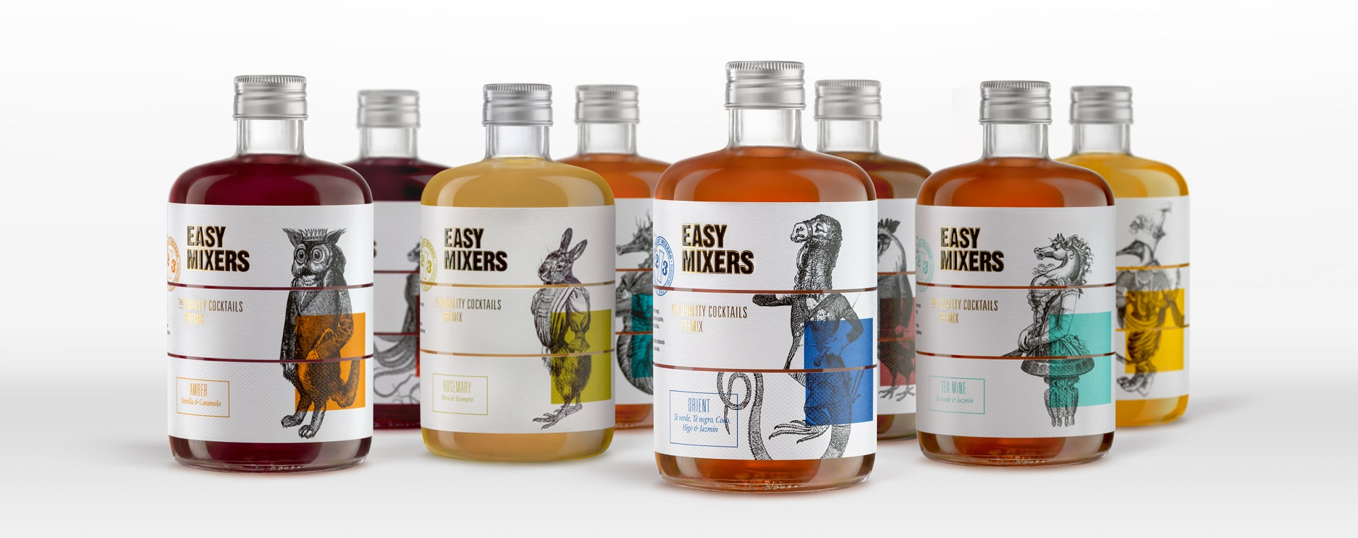
This allowed design studio The Show Must Go On to take advantage of the aesthetics of the time and implement it within Easy Mixers‘ packaging, which makes the subject of our weekly #ThrowBrandThursday column. And while the bottle carries the typical shape of the pharmaceutical bottles of that age, the looks of the labels were inspired by another current, which took place around the same time as the ban, only in another part of the world.
We land in the Old World, the Europe of 1925, a time in which the cadavre exquis (exquisite cadaver or exquisite corpse) was born. Invented by surrealists, the technique “asked” participants to write or draw something on a piece of paper, then fold it, and pass it to the next player who does their part of the contribution. The results were simply bizarre.
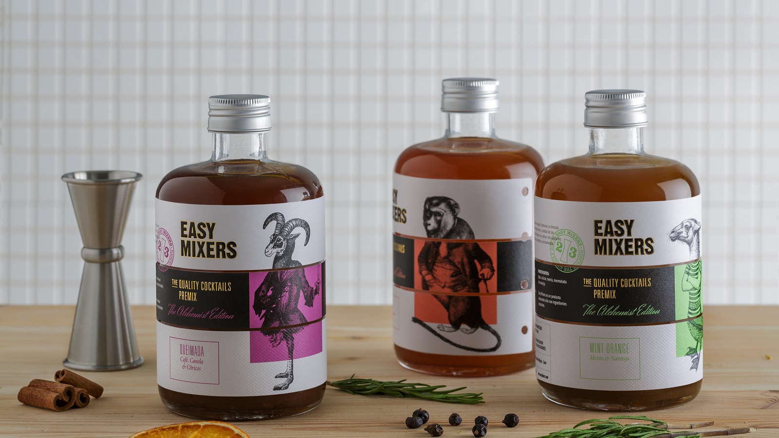
“This way, our own particular Easy-Mixers pharmacist/alchemist starts a cocktail which will then be finished by a barman, wherever they may be found in the world, in the simplest of ways,” says the team behind the project. And just like that, this artistic phenomenon is reflected not only on the packaging but also in the way a cocktail is being made.
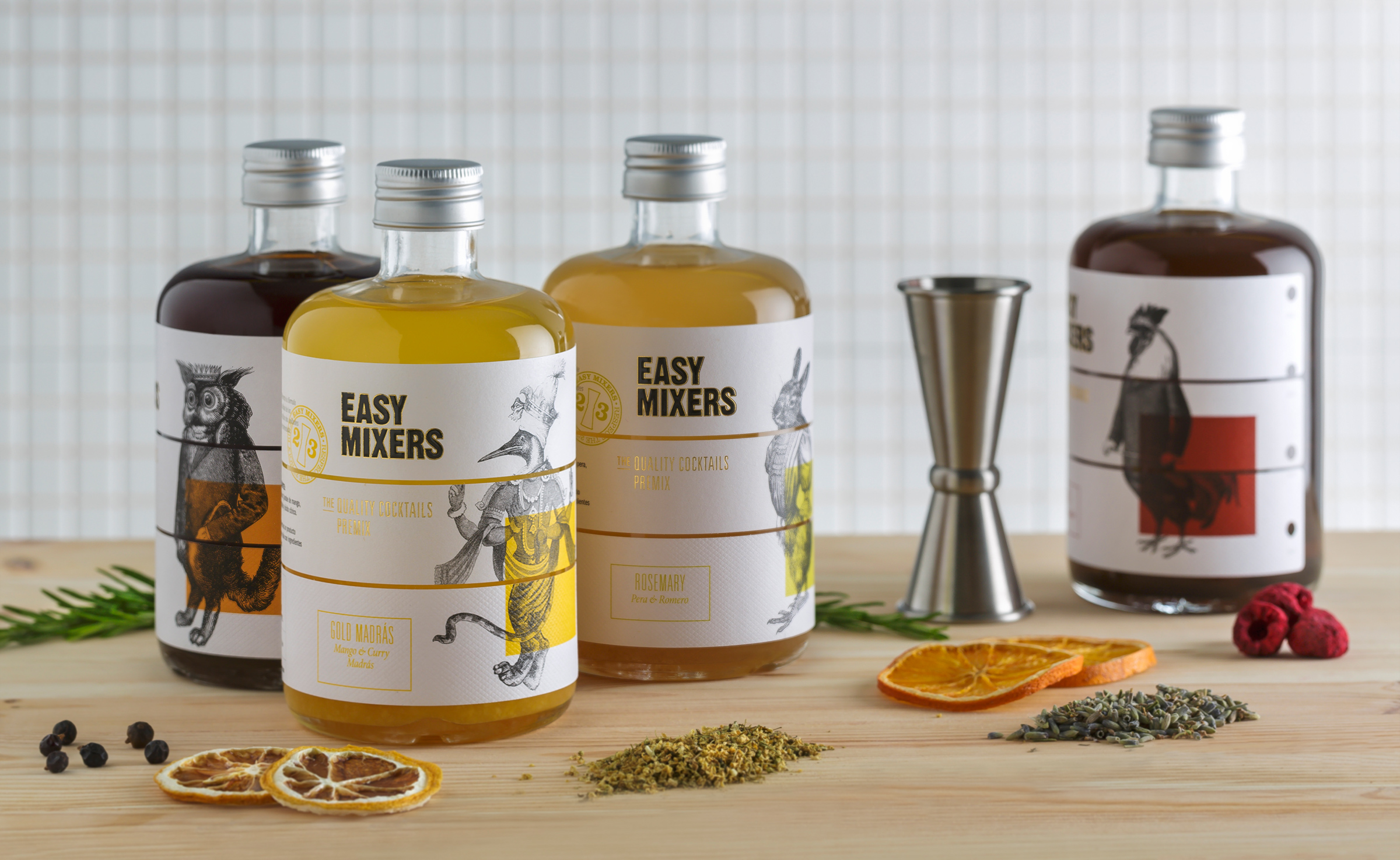
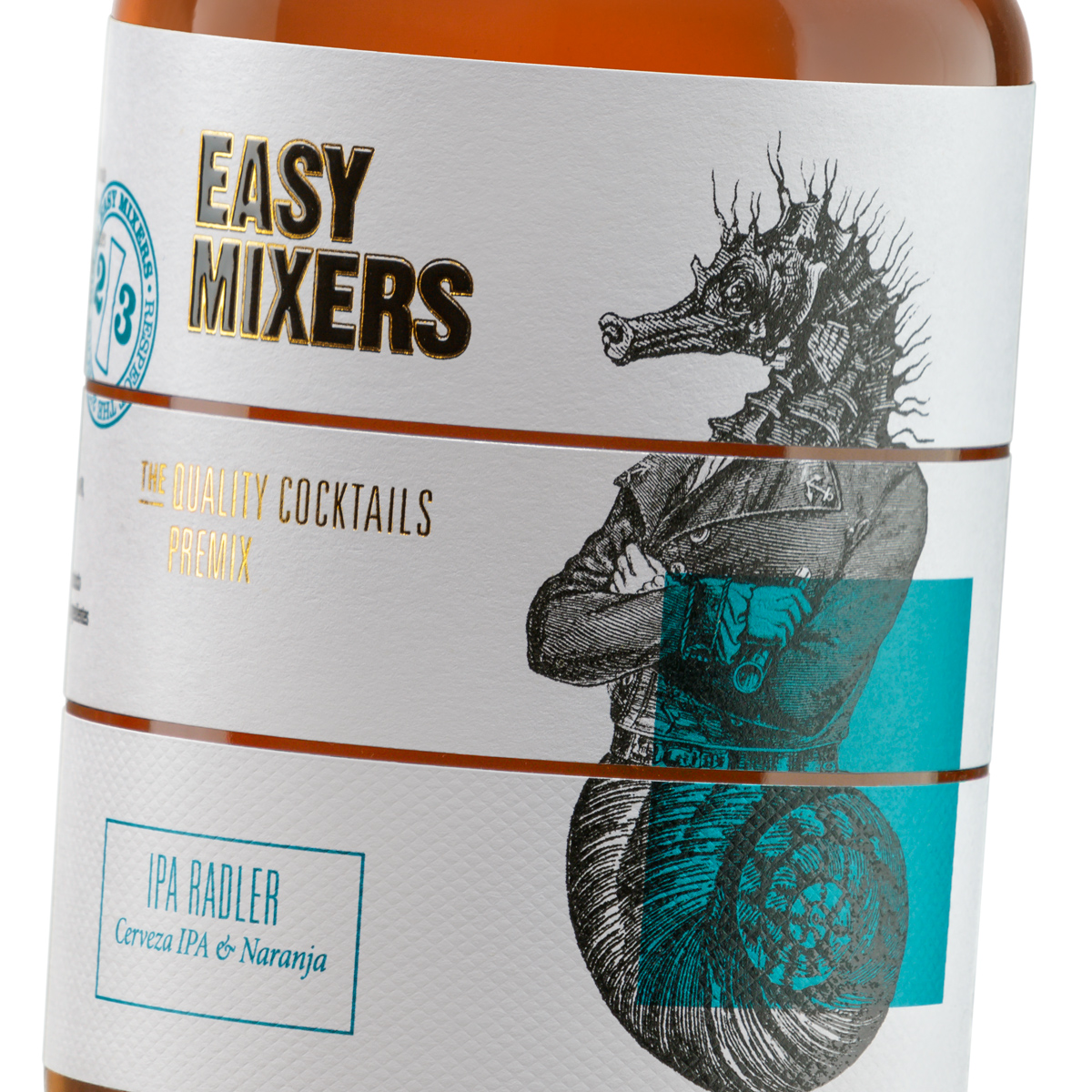
Each label is sectioned in three equal parts, each delimited by a line. Each band has its own illustration. Once put together in the same way as the exquisite cadaver technique, they reveal a new character that has a new personality that is strongly linked to one of the Easy-Mixers varieties. But unlike the original works that seem chaotic, these ones make more sense to us, as they remind us of so many hybrid creatures…