Imagine that every single minute, a garbage truck pours its worth of plastic into the ocean. Not a pretty sight, is it? A 2016 study shows that, if humanity continues like this, the number will increase to 2 trucks per minute by 2030. 4 per minute by 2050. This could mean that, in the future, the waters will host more plastics than fish.
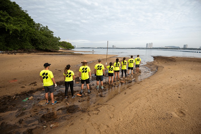
Since 2018, Seven Clean Seas (SCS) has been pulling more than 100,000 kg of ocean plastic out of the waters, most of which is post-consumer plastic. The Singapore-based beach clean-up community removes a minimum of 1kg for every $2 they receive, focusing their efforts in the top seven most plastic-polluted places in the world.
SCS began its mission as an environmental movement that began acting cross-border thanks to the members’ efforts and work. The social enterprise developed the world’s first plastic-offsetting service, a mechanism that allows companies to achieve plastic neutrality. To defeat plastic pollution, the organization needs to ally with the public and private sectors. Amongst some of its strategic partners are Microsoft, Marina Bay Sands Singapore, and ECCA Family Foundation.
As SCS launches products specifically aimed at the UK B2C market for the first time, it needed a new brand identity, one that shifts away from visual environmental clichés to something that expresses the reality of what the oceans are going through but also one that assures guards are on their way. 20something, a creative agency that is set up to explore what is “changing in the 20s,” was tasked to create the new visual language for SCS.
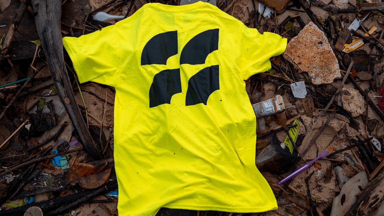
To make it “stand out in a sea of blue,” the London-based agency created an identity that matches the urgency of the problem we face. As such, it borrows a near-neon-yellow color — a hue commonly used on both alarming nature hazard signs and hi-visibility workwear. This alerts people about the work that needs to be done to significantly reduce plastic pollution in the oceans while conveying a feeling of safety.
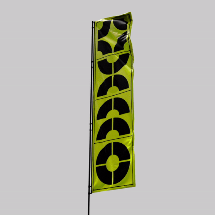
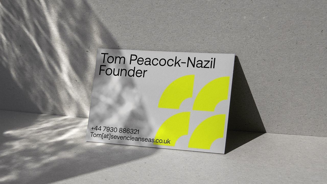
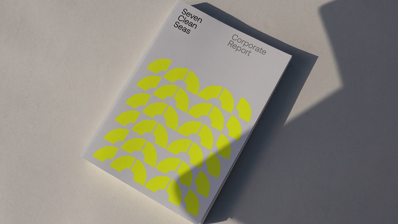
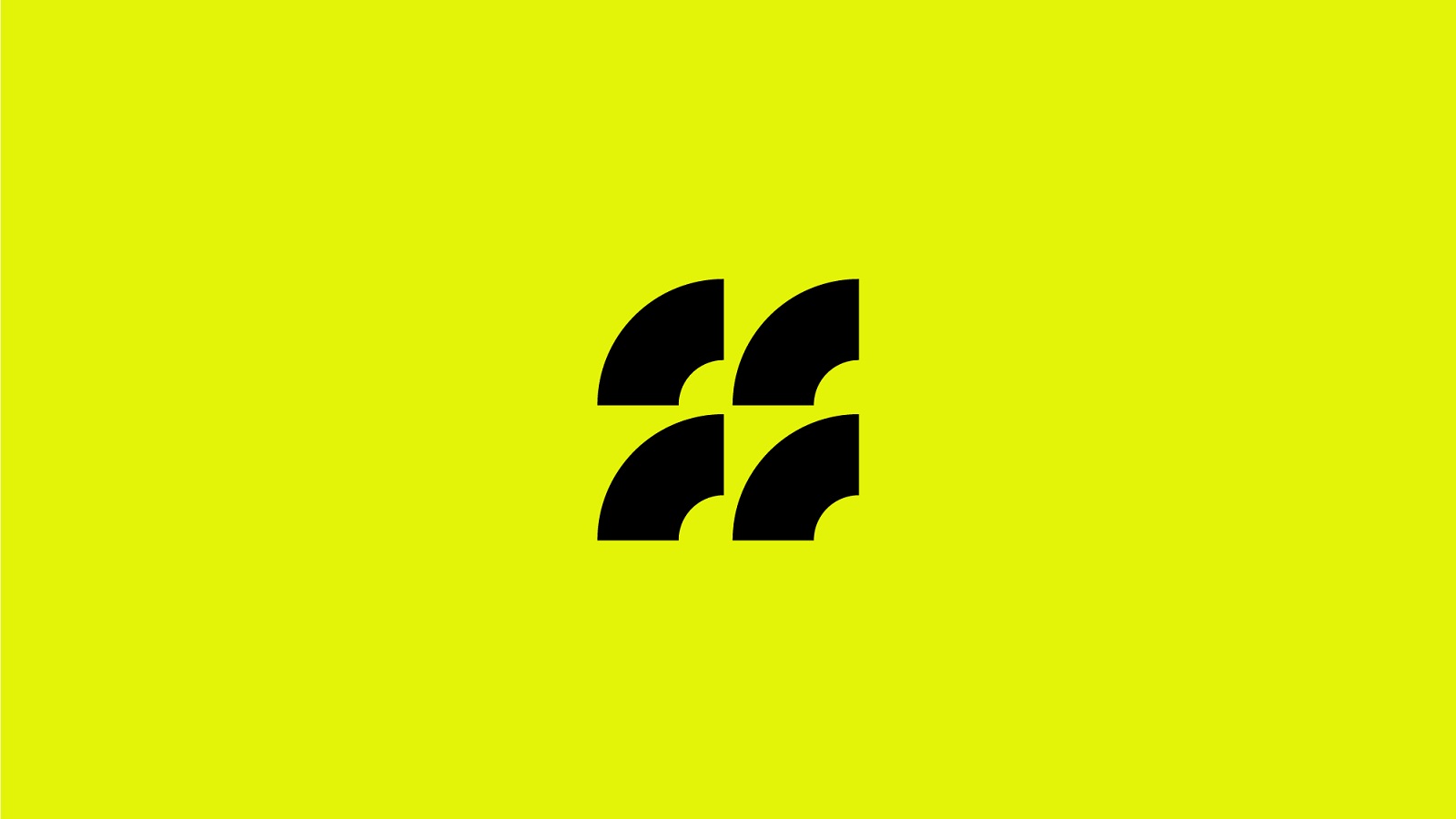
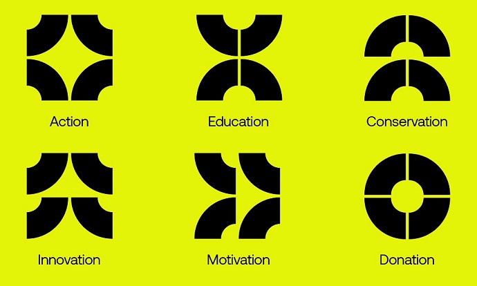
The ocean conservation business “deserved a brand identity no other business had,” as it does things no other business does. Thus, the identity distinguishes itself through a visual motif inspired by ocean currents and their role in distributing plastic waste globally. The logo is formed on a basic grid structure, which allows it to “move” to be in line with the different areas explored by SCS.
For the brand typeface, the agency used CoType Foundry’s Aeonik, letting 20something craft a brand that can adapt to different situations, from corporate reports and presentations, down to social media and even workwear gloves. The goal was to make sure that the typeface feels both appropriate and inviting to viewers, regardless of the message or content contoured.
For SCS, honesty is a precious value and, as such, its website delivers live data thanks to rich Seven Clean Seas’ database. A visit to their website will give users insights into the total amount of plastic removed or details about what is cleaned on each beach.
The full rebrand also consists of new crew uniforms, volunteer T-shirts, functional apparel, river cleaner designs, and a social media toolkit. For the latter, 20something built SCS a series of interactive filters. Tom Peacock-Nazil, the founder of Seven Clean Seas, says: “We’ve worked closely with 20something to develop a brand which truly represents us as a company. The team has created a bold, stand-out design that brings to life our hands-on approach to the ocean plastic crisis as well as setting us apart from our competitors. As a company, we’re at the beginning of our fight against ocean plastic and the launch of our new branding is the step-change we need to take our operations to the next level.”