More than 22% of the FMCG category is occupied by the dairy market, according to the Russian branding agency Depot, meaning that this sector also offers the largest market for packaged products. However, this translates to fierce competition. To grab consumers’ attention and reach their hearts in a memorable way, a brand has to be different.
To make its Milgrad brand stand out on the shelf, Bryansk Dairy Plant reached for the Moscow-based agency’s help, asking the team to rebrand the packaging design for the dairy product line. Milgrad is “the first brand of dairy products that brings happiness,” which gave the agency the idea to work on something adorable, allowing the brand to better connect and communicate with the target audience.
Assuming that you are one of the people who read the cereal box while having breakfast and loves this morning routine, we have a suggestion to make — one that wouldn’t disrupt your ritual, but rather complement it. How about following the lovely adventures of Milgrad the cat, which you can read about from a box as part of the brand’s packaging design?
During this week’s #ThrowBrandThrusday, we are reminding you of the Milgrad cat, which became popular shortly after the newly designed products were launched back in August 2020, being in the spotlight on Japanese Twitter, Behance, Russian TikTok, and it even made it to a meme on 9gag and pikabu.ru.
When planning the packaging design project, Depot took into consideration three options: It had to be updated yet consistent with the previous version; technological — to highlight the energy of a big city; and lastly, use a sweet approach in order to establish an emotional bond with the public. The team settled on the latter, choosing cats — which are usually associated with milk — as a way to interact with the public.
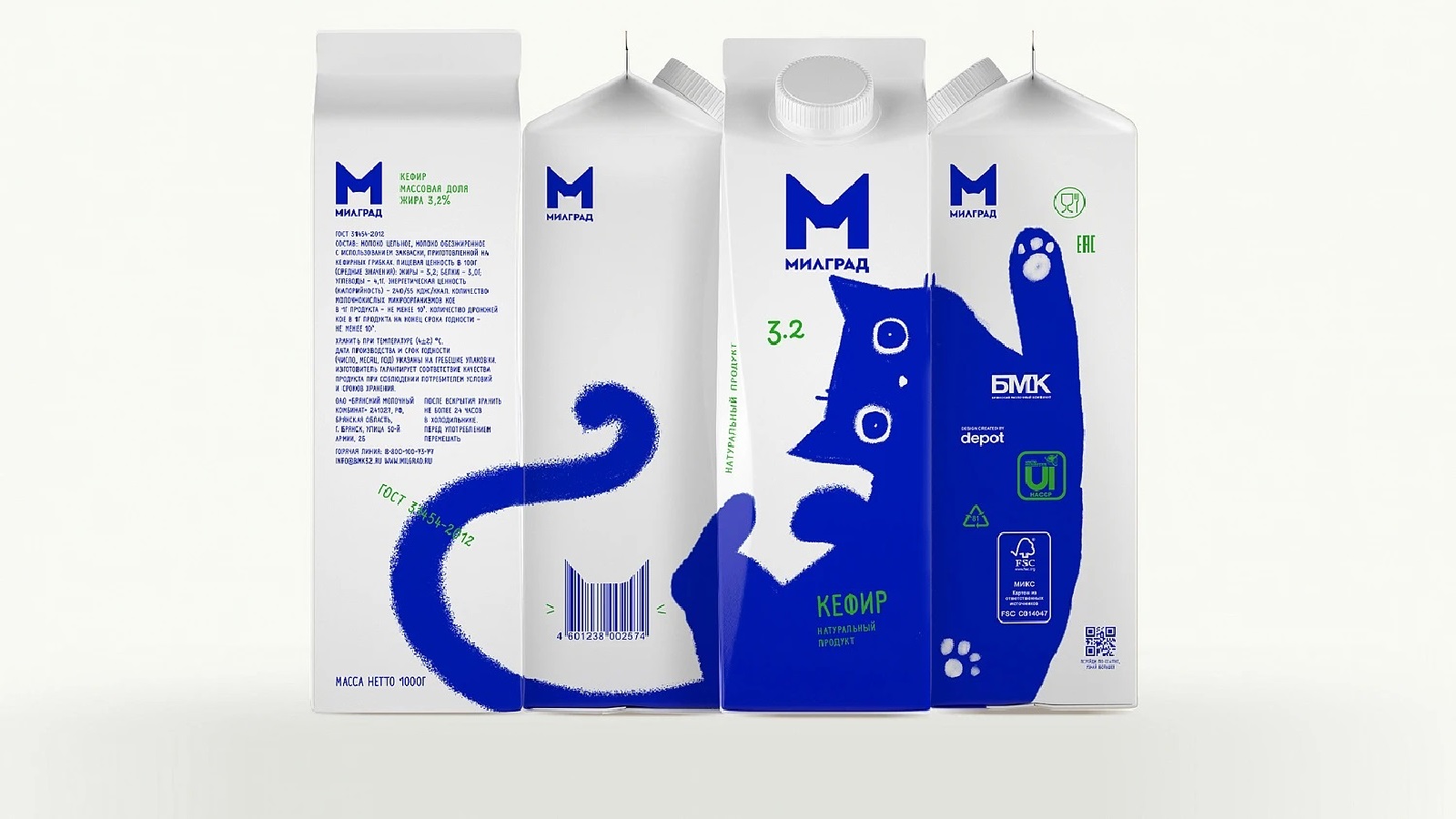
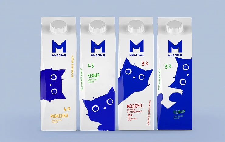
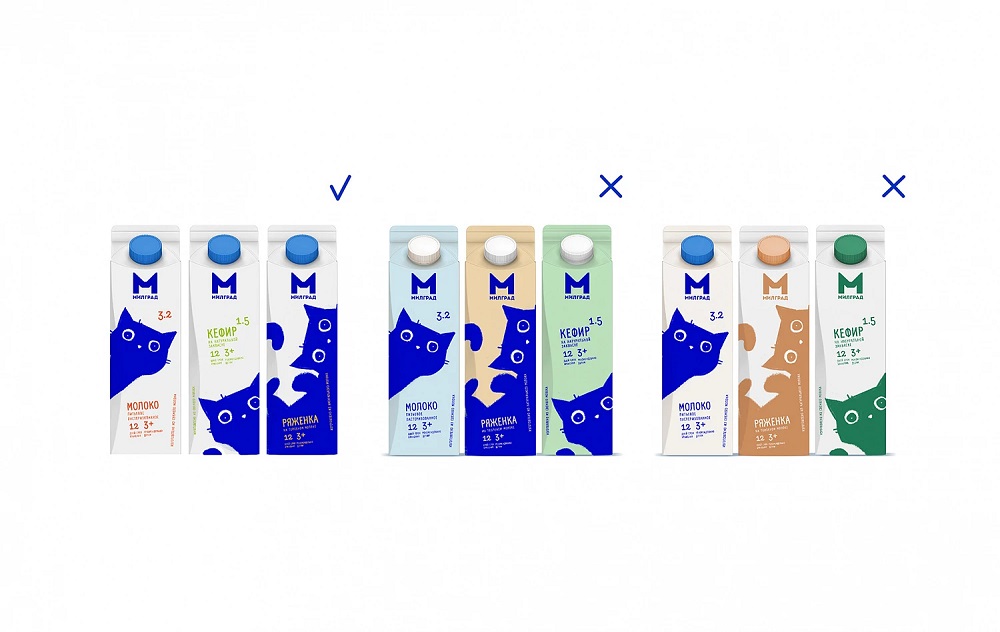
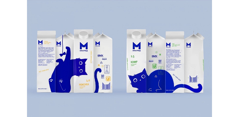
The concept was inspired by Brunhilde, the cat of the art director responsible for the design, Vera Zvereva, who embellished the looks of different milk products with the silhouette of a feline friend. After debating on the color palette for each product, the agency, along with the client, decided to use a more minimalistic approach, leaving the main color (white) for the packaging background while using blue color for the illustrations. Thus, products such as milk, two types of kefir, and ryazhenka — a traditional fermented milk product — can be differentiated by the color of the font.
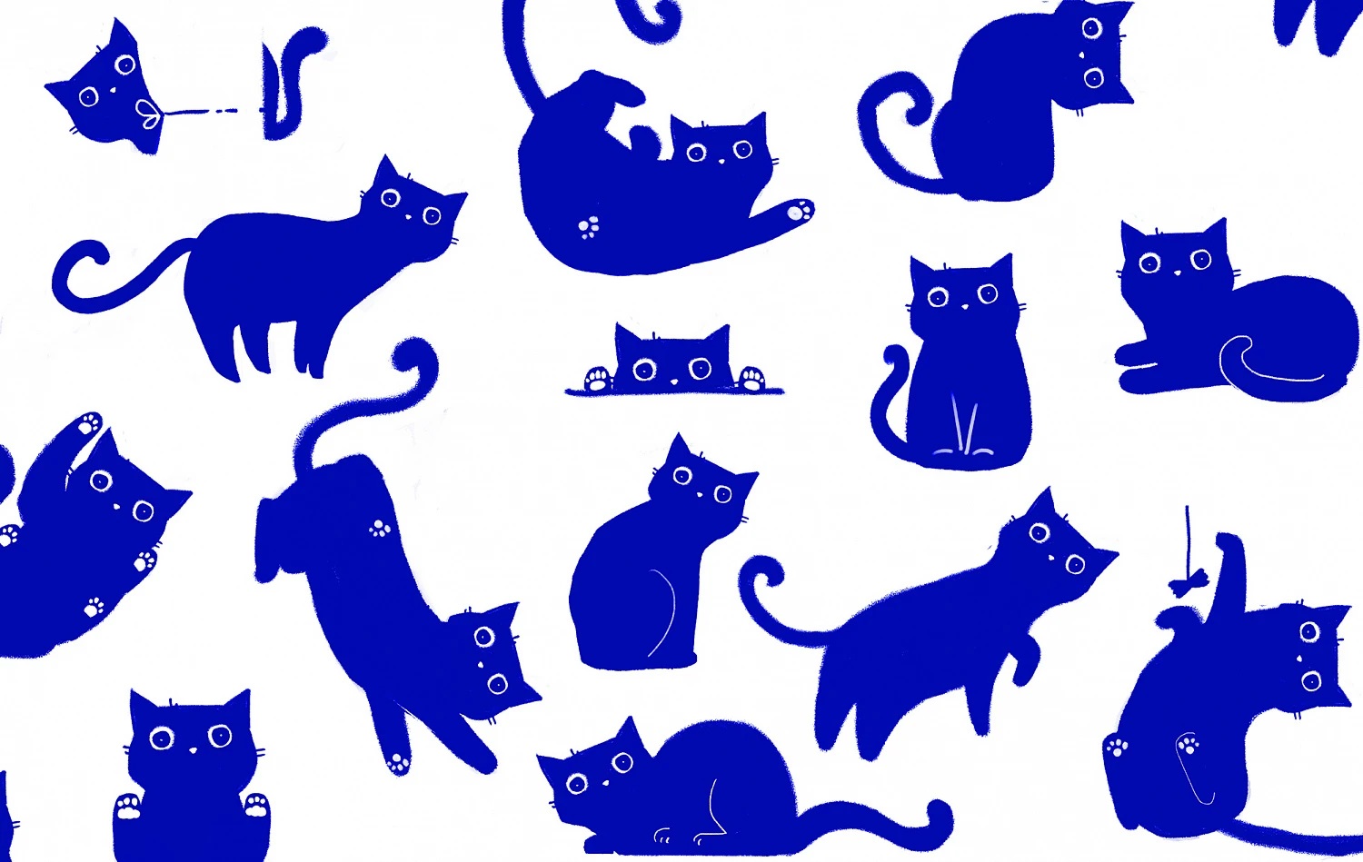
Interestingly, these boxes have a narrative, as the cute figure with big eyes “hides” more. By turning the box at a different angle, consumers can see that the milk cartoons feature other illustrations which look like being part of a bigger picture. Once the pieces of this unusual puzzle are combined, they reveal the image of the curious cat doing different kinds of activities that most pet owners will instantly recognize.
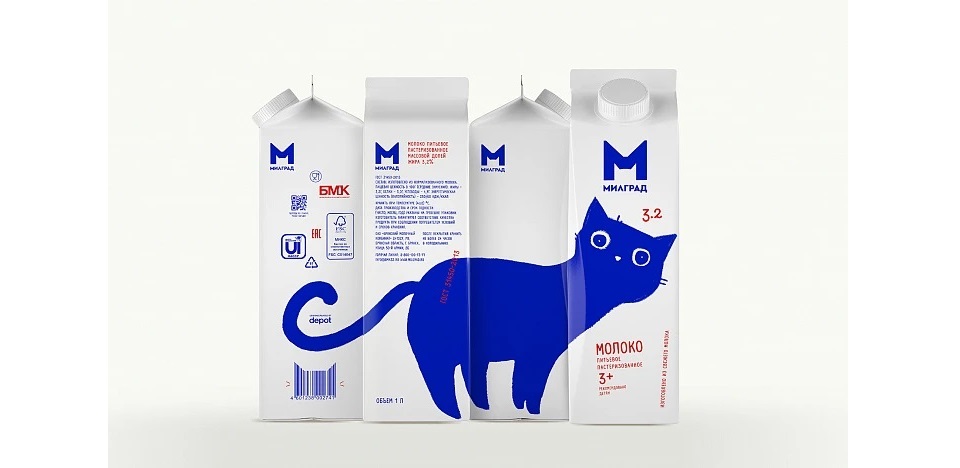
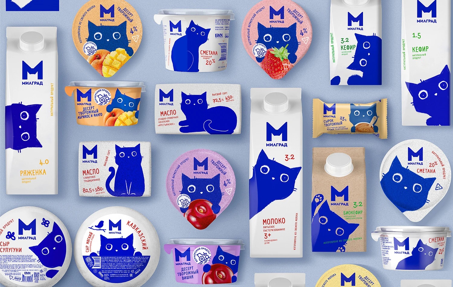
The cat-inspired design can also be found on other Milgrad products. Sour cream, cheese, butter, and biokefir amongst other products proudly display the ambassador’s playfulness, thus reinforcing the idea that the brand brings happiness. The logo was yet another element the agency worked on, interpreting it in a more modern way. It is described via the capital letter “M” which cleverly outlines the contour of a cat’s head.
Credits:
Client: Bryansk Dairy Plant
Brand: Milgrad
Agency: Depot
Art Director: Vera Zvereva